
Morphe x Jaclyn Hill Palette Review
Morphe x Jaclyn Hill Palette Review


Hey everyone, today I have a review on the Morphe x Jaclyn Hill palette which I bought on Monday from Beauty Bay for £37 which is just over £1 per eyeshadow as there are 35 colours in this palette. The colours look as if they are made for different eye colours and skin tones which is really nice for a palette.
The palette itself is really nice, the packaging is so plain and simple just plain white with silver writing on it. Inside the palette it has a cute little message from Jaclyn saying something along the lines of "this palette is dedicated to all my loving subscribers" which I think makes it really personal and sweet. The palette has the shade names in the back which is good but I personally would’ve preferred it to be underneath the shades in the palette but that’s just me being picky. The palette is also made from a sturdy cardboard, similar to a hardback book. This means the palette will probably wear and tear a bit easier than a plastic one would but it’s nothing too bad.
Colours

Swatches of the palette
The colours in this palette are really pretty especially the 4 colours on the bottom left hand side, these are what mainly drew me to the palette. There is a mix of mattes and shimmers in here and I am also going to talk you through each colour briefly, starting with the shade in the top left hand corner which is called "Enlight." This is a shimmery white shade which is slightly darker than the one beside it and it has a few flecks of gold in it; this shade would be great for your inner corner highlight. The second shade is another shimmery white shade called "Beam" and this is a more icy white shade than "Enlight" which is also great for an inner corner highlight. The next shade is a pale brown shade which is called "Silk Creme;" this is the perfect transition shade and will suit a lot of different skin tones. The next shade is a slightly darker brown shade called "MFEO" which would make another great transition shade and will also suit different skin tones. The next shade is a pale pink shimmery shade called "Faint." I absolutely love this shade, I used it on the look below and it looked so pretty. The next shade is a dark pink shimmery shade which has gold flecks in it to make it a sort of rose gold kind of colour! I am in love with it, I think this is one of my favourite shades in the palette and I did use it on the look below but the lighting wasn’t fantastic so it didn’t show up as much. This shade is called "Sissy." The next shade is another pink which is between the other 2 pink shades. It is another shimmery shade and has some flecks of gold in, this shade is called "Little Lady."
Onto the second row, the first shade is called "Creamsicle" which is a bright orange shade. I didn’t think that I would wear this shade but I managed to put it in the look below just a little bit of it but it didn’t show up that much with my lighting not being fantastic. The second shade is called "Butter" which is an orangey-brown shade that is slightly darker than the other browns I’ve shown you, this will also suit people with darker skin tones or it can be used in a warmer eye look. The next shade is another dark brown shade called "Pooter" this isn’t quite as dark as the one next to it but it’s darker than the ones above. This would be a shade to suit darker skin tones too or warmer eye looks. The next shade is called "Pukey" and to be honest the only way I could describe this colour is literally like a pukey brown or a diarreah brown as awful as that sounds. I’m pretty sure that it will work well and create some nice eye looks but the name and shade of brown does put you off a little. The next shade is called "Hunts" which is a browney-red that reminds me of the shade "Cayenne" in the "Naked Heat" palette. That is a shade that I use a lot of in my "Naked Heat" palette so I can tell I will get some use out of this shade. The next shade is called "Firework" which is a shimmery red with gold flecks in, this also reminds of the shimmery red in the "Naked Heat" palette. Just to clear things up I am not comparing it and saying that Jaclyn Hill has copied the "Naked Heat" palette I am just trying to give you an idea of what the shades are like. The next shade is called "Queen" which is an absolutely gorgeous shimmery gold shade. It is absolutely stunning.
Onto the next row, the first shade is called "Obsessed" which is like a very pale rose gold shade. It is a very pretty shade and I need to try it out soon. The next shade is called "SBN" which is a shimmery medium brown shade. I think that this one would look really pretty on, I think it would also suit darker skin tones. The next shade is called "Hillster" which is a shimmery dark brown shade with gold flecks in that make it look like a dark copper shade. The next shade is called "Roxanne" which is quite similar to the shade "Hunts" but "Roxanne" has a much more brown undertone to it whereas "Hunts" has a more red undertone. Another way I would describe "Roxanne" is a more maroon shade. The next shade is called "Jacz" which is a burgundy shade that is absolutely stunning. I think that a lot of nice looks can be made with this shade. The next shade is called "Buns" which is another matte dark brown shade. The final shade on this row is called "Cranapple" which is another shimmery red but it’s a lot darker and more of a shimmery burgundy which I think is really pretty and can’t wait to create some looks with.
Onto the second to last row, the first shade is called "Royalty" which is a shimmery ultraviolet kind of purple shade. I think that this shade is really pretty and a lot of looks can be made with this especially if you have blue eyes! The next shade is called "Twerk" which is a shimmery royal blue shade and this is absolutely beautiful! I normally hate royal blue as a colour but I think it could easily work in an eyeshadow. The next shade is called "Hustle" which I would describe as a shimmery taupe shade, I could be wrong but that’s what I see in it. I think it will look really pretty on. The next shade is called "Meeks" which is a shimmery dark brown colour but it’s not like a copper colour, again it’s another hard colour to describe. This could definitely work with darker skin tones though and warmer eye looks. The next shade is called "24/7" which is a very dark brown shimmery shade. I would love to see a look created with that. The next shade is called "Chip" which is a maroon matte shade that is really pretty and could work as an outer corner shade. The next shade is called "Mocha" which is like a milk chocolate kind of colour. I think that this is a pretty colour too and it that it would work well as a shade to darken your crease a little bit.
Onto the final row, the first shade is called "Pool Party" which is a shimmery turquoise shade which I absolutely love. I love the shade of turquoise that the shade is in. I also own the BH Cosmetics "Galaxy Chic" palette which has a couple of turquoises in but they’re aren't as dark as this one. I can’t wait to try a look out with this shade. The next shade is a slightly darker turquoise shade, more of a teal kind of shade which is called "Jada." I think that this shade is something very different to what you would see in other palettes, it’s quite unique and that’s what I love about it. The next shade is called "Diva" which is a shimmery dark green shade which again I think is quite unique. The next shade is called "Enchanted" which is an even darker green shade but it’s a matte one, I think a lot of great looks could be made from this one. The next shade is called "Central Park" which is a very dark brown shade a bit like tree bark. Maybe that’s where she got the name inspiration from. Who knows? The second to last shade is called "Soda Pop" which is a brown-black, you could easily get away with this to use with eyeliner, especially if you are using a dark brown one. The final shade is called "Abyss" which is a super matte black, that every palette needs so that is great.
Formulation
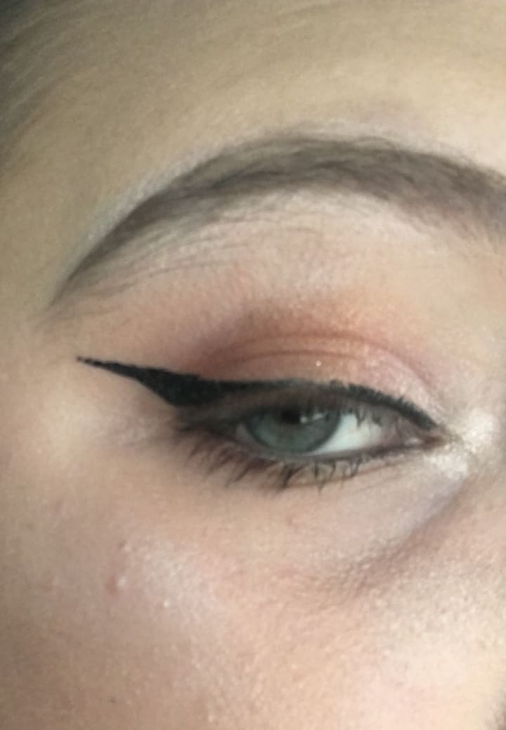
A look that I tried the other day.
The formulation of these eyeshadows is really good. They blend really well and the pigmentation is definitely there. Hopefully you can see what the pigmentation is like above, the lighting was not perfect when I took this photo and also you will have to excuse the state of my skin. I am going through a bit of a stressful time at the moment so I’m becoming prone to spots and I did use a colour corrector underneath to get rid of the bags under my eyes but that didn’t really work, also my eyebrows really needed doing before I put anything on them but at least you have an overall idea what the pigmentation is like. Unfortunately I did find that some of the shades have a lot of fallout and when I tried the turquoise shade it didn’t really show up shimmery on my eyes, although that could’ve been the lighting but I checked in the bathroom mirror where our best lighting is and the shimmer didn’t really show up. I tried applying it with a wet brush as well and not much more really happened, so I was disappointed with that but I will try with it again and see how I get the best payoff but for now that is the only let down I have with the palette.
All in all I do recommend this palette to anyone, there are so many colours in here to suit different eye colours and skin tones and I also think that it’s worth the money at £37 for 35 colours.
Thank you for reading my post and I hope to see you again soon.
About the Creator
Lauren Carr
Just a Yorkshire lass who is here to write about girly things such as make up, fashion, hauls and may even throw a couple of extra bits in there
Keep reading
More stories from Lauren Carr and writers in Blush and other communities.
Top 50 Favourite Songs
Today’s post is my go to playlist at the moment, I definitely recommend trying these songs if you don’t know them at the moment. My music taste differs so I can go from a top Ibiza DJ to green day. I hope you enjoy. I am going to give a brief explanation of why I like each song below.
By Lauren Carr6 years ago in Beat
Sun Tanning: Understanding Its Impact on Your Skin Health
Although paces of indoor tanning have been dropping in the US, many individuals try to get a tan outside. As per a National Cancer Institute Interview Survey of data from the 2020 National Health Interview Survey, around 39% of women and 29 percent of men in the US had an open-air tan in the past year.
By shanmuga priya5 days ago in Blush
The Gen Z Entrepreneurial Revolution
It is hardly debatable that the world has always been run by a bunch of aging dinosaurs, mostly male, who refuse to allow the younger generation to bring about changes. Politicians and leaders everywhere refuse to release the reigns of creativity and leadership until they are dead or dying. It is time to give the young a chance to revolutionize and change the entire landscape of their existence. Those of us with one foot in the grave, so to speak, should wake up and realize that we are not the ones who will be living in the world in the years to come.
By Novel Allen8 days ago in Writers


Comments
There are no comments for this story
Be the first to respond and start the conversation.